Hace 12 años.
9/08/2009
GUGENHEIM DESIGN IT COMPETITION / PROJECT SELECTED!
Hello everyone!...my project has been shortlisted for the Guggenheim Design it competition at NY. I need to get the most of the votes to arrive there and get the people's prize.... ..... you just need to enter into this link and vote for the "BEFORE SUNSET"(Ecohab shelter)!!!
VOTE FOR "BEFORE SUNSET PROJECT"(CLICK HERE)
Thanks for your support guys and best of luck!
If you want to see more about the project please check this link:
PROJECT IMAGES(CLICK HERE)
Etiquetas:
architecture,
design it competition,
ecohab,
google,
guggenheim,
sketch up,
tayrona
9/20/2008
Tyle to play - Caesar Design Contest

This project starts from the idea and the representation of the sensuality, the passion and the eroticism across an interior design finishing.
Project Images (Click)

The red bubble tyle has been inspired by the organic forms of the nature and women body. It’s a commemorative element of love and seduction printed on the surface of internal spaces. It’s also an element that comes alive impelled by the situations of the couple’s daily live.


The red bubble has a warm and elegant finishing that explores in the users a world of introspective sensations, experienced through the meaning of pleasure.
The concept of sensitive architecture is obtained now that you can have the sensation of touching and feeling at the moment of a romantic dinner on the terrace, as having a shower in the bathroom, and also as enjoying a pleasure massage.

This tyle designed specially for love and passion, is also adapted to the function of the internal space in which has been putted it on. That´s why it can become in to an useful element to massage your back or your feet. It can also become in an ornamental and functional piece of furniture in order to put objects related to the bathroom, the kitchen, the terrace, and so on.

The format of the red bubble-caesar is a key-frame of 30x60 cm. The other two suggestions colors for its application are the glossy -white and the opaque black.
Explore new sensations through the senses and Caesar.
Etiquetas:
achitettura,
architecture,
arquitectura,
caesar,
design,
hot design,
italia,
love,
metal milano,
passion,
red,
rodrigo montoya,
sensual,
sex design,
tyle to play
6/24/2008
got milk bar zone (Click to see project images)
Milk is be healthy and grow strong!“ .
Project Images (Click)
Got milk wall is the new revolutionary system developed to introduce children into the meaning of healthy drinks through the possibility of preparing with their parents their own fun milk cocktail.

Nowadays the meaning of the milk like a healthy element is lost, and the fact that this element helps on the kids growing is not important anymore. Our project is about think again in the milk like an important and healthy element for children and adults; putting on the aperitivo places a system of furniture and products that allows children and parents to prepare their own milk cocktail in a brand new cool way!.

This system called “got milk wall” has been designed with all the elements, the furniture, and the products necessary to prepare the best cocktails and to be comfortable at the time of drinking them as well.
The main system is compound by two elements.
The first element is located on the upper part of the wall. This element is a contemporary painting compound by colorful circle shapes and lines. The circle shapes contains table furniture which adults can reach to put off, on to the got milk zone.
The second element is under the first one and is a service table that contains all the tools and products to prepare the milk cocktail. An auto-portable blender and special glasses are in the tools group. Milk, flavors and shots for adults are in the ingredients part. A special modular chair system has been designed under the service table. Children can reach this chair system to put them on the got milk zone as well as the adults do. Two special freezers have been designed and put inside the got milk wall to maintain the freshness of the products during the aperitivo time. (between 6 and 9 pm). Finally a water sink has been designed at the final of the service table, to create educational hygienic and healthy habits in to the children.

Basically the got milk wall is a bar-wall-buddy that’ll interact with children and parents, showing and offering them a special, fun, colorful ambient to share and drink healthy cocktails together.
Project Images (Click)
Got milk wall is the new revolutionary system developed to introduce children into the meaning of healthy drinks through the possibility of preparing with their parents their own fun milk cocktail.

Nowadays the meaning of the milk like a healthy element is lost, and the fact that this element helps on the kids growing is not important anymore. Our project is about think again in the milk like an important and healthy element for children and adults; putting on the aperitivo places a system of furniture and products that allows children and parents to prepare their own milk cocktail in a brand new cool way!.

This system called “got milk wall” has been designed with all the elements, the furniture, and the products necessary to prepare the best cocktails and to be comfortable at the time of drinking them as well.
The main system is compound by two elements.
The first element is located on the upper part of the wall. This element is a contemporary painting compound by colorful circle shapes and lines. The circle shapes contains table furniture which adults can reach to put off, on to the got milk zone.
The second element is under the first one and is a service table that contains all the tools and products to prepare the milk cocktail. An auto-portable blender and special glasses are in the tools group. Milk, flavors and shots for adults are in the ingredients part. A special modular chair system has been designed under the service table. Children can reach this chair system to put them on the got milk zone as well as the adults do. Two special freezers have been designed and put inside the got milk wall to maintain the freshness of the products during the aperitivo time. (between 6 and 9 pm). Finally a water sink has been designed at the final of the service table, to create educational hygienic and healthy habits in to the children.

Basically the got milk wall is a bar-wall-buddy that’ll interact with children and parents, showing and offering them a special, fun, colorful ambient to share and drink healthy cocktails together.
Etiquetas:
architecture,
children space,
domus academy,
got milk,
healthy,
interior design,
kids,
milk bar,
milk cocktail,
product design,
rodrigo montoya
6/13/2008
Pubblicità impossibile (Concorso Nastro Azurro)
Immagini concettuali (Click)
Questo progetto nasce dall’idea di rappresentare l’originalità, la creatività e la dinamicità del brand Nastro Azzurro.
Grazie all’utilizzo di un un muro di pubblicità inserito nella città si è voluto creare un elemento di comunicazione urbana. Il muro, composto da grandi box stampati, si sviluppa come un elemento cubista inserito in un ambiguo spazio urbano. Da qualsiasi punto di vista è possibile osservare l’immagine fragmentata del marchio e della bottiglia, ma, spontandosi in un punto specifico, si può construire l’immagine visuale perfetta della bottiglia Nastro Azzurro.
Questo muro, così pensato, diventa una pubblicità impossibile per la città. E’ un oggetto astratto, ma in armonia con la filosofia, l’originalità e l’ironia della birra italiana “Nastro Azzurro”.
Este proyecto nace de la idea de representar la originalidad, la creatividad y el dinamismo de la cerveza Nastro Azzurro a través de un objeto que se inserta en la ciudad como un gran muro publicitario.
Este muro compuesto de grandes cajones impresos, se desarrolla como una “pintura cubista” dentro del contexto urbano, transmitiendo imágenes fragmentadas y veloces alusivas a la marca y a la botella desde cualquiera de sus ángulos, pero también, ubicándose en un punto estratégico y único del contexto, se puede construir la imagen visual perfecta de la botella de 33 cl.
Este muro publicitario el cual se puede ver desde cualquier punto de vista y también desde solo uno de ellos, se convierte en una “publicidad imposible para la ciudad”, un objeto que refleja la ironía y la originalidad de la cerveza italiana Nastro Azzurro.
6/08/2008
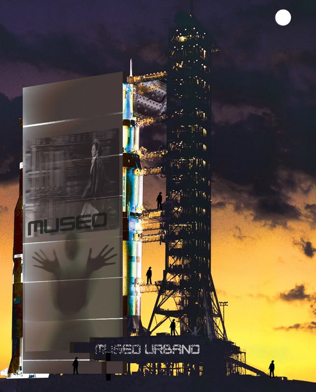
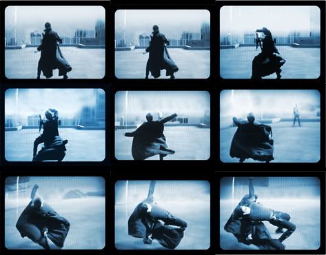
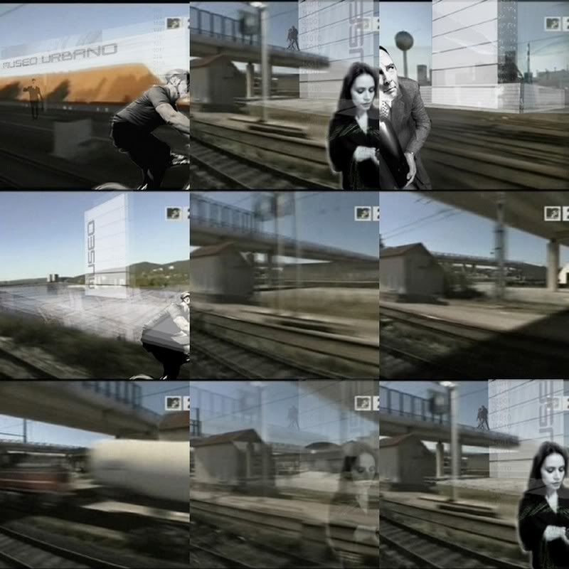
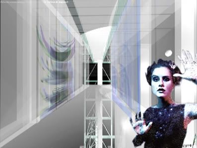
M.uro / Museo Urbano interactivo
5/31/2008
Domus Academy reunion 2008
Etiquetas:
campari,
domus academy,
installation,
italia,
milano,
rodrigo montoya
5/15/2008
NET AND NEST
See project images (Click to see)
The main purpose of this project is to provide a new interior design system to the CMC offices in Ravenna.
The project starts from the idea of communication, concept that reflects the ideology of productivity of CMC company, plus the component of interaction and social networking between its employees.
Concept images (Click to see)
Now a days “communication” is one of the principal problems in the office. Computer, telephone, fax and all “communicative machines” are inserted in the “individual space cell” making a perfect environment to the ideal productive and concentrate worker; but in this case, this cell is providing good elements to work in a virtual net-community but is not creating social interaction and communication between the people that are working in the same place.
That’s why the project introduces the idea of a double high space structured by programmatic boxes, bridges, and a furniture system with open layout. These three elements defined the configuration of the space with visual communicative interaction between the people that are working inside the building.

The boxes hanged from the ceiling, represents the idea of transparent luminous lamps that are giving atmosphere and pleasure to the ones that are working above them. These boxes contained the program of meeting room and archive, programs that are related with the idea of communication and informative sources in the building. These boxes are connected one to the other with a system of semi-transparent bridges.

The first ground floor is structured in open space with a furniture system that provides multiple possibilities to the configuration of the space; that’s contemplated possible future growing of the CMC tree. This furniture system is designed with a modular hexagonal shape that simply represents how to grow or change the system in the interior space in a very flexible way.
Furniture concept(Click to see)
Color has an important role in the project; strong colors are putted on the boxes and some of the walls of the space, realizing this idea of communication with a colorful strategy. Strong blues and oranges have been putted on the boxes creating a lively and contemplative atmosphere; yellow and red have been putted on the main core to introduce the sense of “location” inside the building. Finally a shiny wood surface has been putted on the floor to create a comfortable open work space and environment.
The main purpose of this project is to provide a new interior design system to the CMC offices in Ravenna.
The project starts from the idea of communication, concept that reflects the ideology of productivity of CMC company, plus the component of interaction and social networking between its employees.
Concept images (Click to see)
Now a days “communication” is one of the principal problems in the office. Computer, telephone, fax and all “communicative machines” are inserted in the “individual space cell” making a perfect environment to the ideal productive and concentrate worker; but in this case, this cell is providing good elements to work in a virtual net-community but is not creating social interaction and communication between the people that are working in the same place.
That’s why the project introduces the idea of a double high space structured by programmatic boxes, bridges, and a furniture system with open layout. These three elements defined the configuration of the space with visual communicative interaction between the people that are working inside the building.

The boxes hanged from the ceiling, represents the idea of transparent luminous lamps that are giving atmosphere and pleasure to the ones that are working above them. These boxes contained the program of meeting room and archive, programs that are related with the idea of communication and informative sources in the building. These boxes are connected one to the other with a system of semi-transparent bridges.

The first ground floor is structured in open space with a furniture system that provides multiple possibilities to the configuration of the space; that’s contemplated possible future growing of the CMC tree. This furniture system is designed with a modular hexagonal shape that simply represents how to grow or change the system in the interior space in a very flexible way.
Furniture concept(Click to see)
Color has an important role in the project; strong colors are putted on the boxes and some of the walls of the space, realizing this idea of communication with a colorful strategy. Strong blues and oranges have been putted on the boxes creating a lively and contemplative atmosphere; yellow and red have been putted on the main core to introduce the sense of “location” inside the building. Finally a shiny wood surface has been putted on the floor to create a comfortable open work space and environment.
Read this document on Scribd: MILD4 NET AND NEST pdf
4/06/2008
When architecture meets nature (Click to see plans)
When architecture meets nature like Chinese did 2500 years ago. These gardens were more that just planted flowers, or green areas. They used to build lakes, hills, bridges and planted trees in other to recreate a perfect place to connect them with earth so they could reach peace (always keeping in mind the four elements).
Now days the Chinese society has change, becoming capitalism force where people like migrant workers take place. This new society had forgotten the beauty of their past, their tradition and the original ambient of the old Chinese culture. That’s why the main concept in the design is to let this beauty come back through the nature, to include the meaning of the garden in their lives.
The whole project starts with a change in the landscape giving movement to earth so the buildings do not take the most important role into the scene, but becomes part of it. This element of the landscape covers the first level of the building, a platform of services where the activities like the preparation of healthy food the social meeting and the relaxation areas are going to be shown.
The second layer of the project is compound by the slabs and the bedroom modules. These elements have been designed with some many voids around them, to create the idea of permeability with interior gardens. These elements communicate one level with others with visuals, light and wind. The main concept of this garden voids has been created with the theory of systems (one module that can be copied, moved, turned right, turned left, mirrored …etc)
The last layer of the building is the skin, the element that is covering the system of modules and green voids. This skin has been created to manage the sun and the temperature of the building in the different periods of the year. This green layer made by polycarbonate modules and steel structure gives good shadows to the building in the period of summer, and comfortable warm places in winter as well. That’s because these modules can retain the warm energy captured by the day. The skin layer is also the principal image of the building, is treated with a forest impression, to camouflage the building into the green environment.
The middle space is also a green area for the building, a huge void that brings light to all the structure. This space is in direct connection with the services level and with all the rooms by the circulation system.
Read this document on Scribd: MILD3 Restless dislocation
Etiquetas:
architecture,
arquitectura,
china,
conceptual,
design,
domus academy,
housing,
Italian design,
nature,
polycarbonate,
project,
rodrigo montoya,
sketch up,
suzhou,
system,
universidad javeriana
2/29/2008
Esculturas arquitectonicas 1
Estudio de forma organica con tecnica de multiples cortes
Etiquetas:
architecture,
art,
arte,
conceptual prototype,
design,
escultura,
rodrigo montoya,
sculpture,
sketch up
2/28/2008
Street furniture for transport spaces / Domus Academy with 3M
The main concept of this proposal is to create a new brand (Virtual Real) included in the 3M portfolio services, for the solution and design of street informative furniture for metropolitan transport spaces.

3M is a global company with more than 25 brand products on the market. Virtual Real will offer its products in the countries in which 3M has opened its market, with new concepts of urban furniture (informative panels, street furniture and projective informative elements with interactive WI-FI connection ). The challenge of this project is the best way of using the 3M products technology with good and innovative applications (Vikuiti and DI-NOC technology).

The first phase of our project realizes the creation of a catalog of services with all the Virtual Real products. This catalog contains four modular systems: Module A (Street furniture), Module B (Bus stop), Module C (Street projector) and Module D (Street vikuiti display). These elements will be use separately or integrated with each other to create different possibilities and different designs also.
see catalog of products
El concepto principal de esta propuesta es crear una nueva marca dentro de los portafolios de servicios 3M para la solución y diseño de mobiliario urbano y elementos de información en los espacios de transporte de las grandes ciudades. 3M es una empresa global con más de 25 productos en el mercado. Virtual Real ofrecerá sus productos en los países en los cuales 3M ha abierto su mercado, con nuevos conceptos de mobiliario urbano para la ciudad (paraderos, paneles informativos, bancas y elementos de proyección urbana con WI-FI). El reto del proyecto y de la nueva marca es utilizar de la mejor forma tecnologías propias de 3M (Vikuiti y DI-NOC)

La primera fase de nuestro proyecto contempla la creación de un catalogo de servicios el cual ofrece los productos para el desarrollo de una propuesta de mobiliario de transporte urbano en una ciudad modelo. El catalogo se divide en cuatro sistemas los cuales son: Modulo A (mobiliario urbano), Module B (Paraderos de buses), Modulo C (Proyector urbano) y Modulo D (Display urbano con Vikuiti). Estos módulos se pueden colocar solos o en conjunción con los otros para crear distintas soluciones en cada lugar.
ver catalogo de productos
Read this document on Scribd: Catalog of product-VIRTUAL REAL
Etiquetas:
3m,
architecture,
conceptual,
design,
di-noc,
domus academy,
google,
imagen,
Industrial design,
productive process,
projection,
sketch up,
urban architecture,
vikuiti,
virtual real
Suscribirse a:
Entradas (Atom)
